Colour Matching
Colour variations
Colour variations from an identical image file should be expected to vary to some degree across various fabrics/substrates.
Each fabric/substrate base has a different base tone and varies in colour, light reflectivity, thickness, weight, opacity and weave. These may all have an impact on the print colour as well as the appearance of the print colour.
Also, various lighting conditions make printed the fabric/substrate colours seemingly vary.
We do endeavour to ensure all of our printers are calibrated for each and every fabric, however, the above must be taken into consideration when ordering the same graphic or colours across various types of fabrics and ink sets. Choosing similar weaves and weights can help to ensure your colours look as brilliant as desired.
Please also note that every once in a while, our printing team tweaks printer calibrations to refine colours. They are constantly on the lookout for new and improved ways to print, strengthening print processes and improving colour precision wherever possible. We might also upgrade our machinery to optimise printing outputs. These can result in some colour variations between two identical orders on the same fabric. These will be minimal, however, still slightly visible. In case some colour variations may impact your work and you wish to reorder after a certain time, we do advise to order new fabric samples shortly before your larger print run. This will ensure you receive prints with the closest colour accuracy possible.
Our inks are also water based. None of our fabrics or inks contain or use Azo dyestuffs. No contaminants of any kind enter the water course thanks to our eco-friendly print process. Read more about Sustainability here.
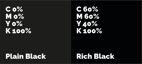
Black vs Rich Black

Colour Match
If ordering more than one different product we advise opting for a colour match as different products have different coatings and materials who take on ink differently. To make them the same colours we suggest colour matching options. If you do not choose this option then you are agreeing that you understand that your products may be different colours to each other.
There is a charge for this and it depends on the number of different products and colours required. This is not a quick process so please bare that in mind is you have a tight deadline.
Pantones & Colour Profiles
We advise providing images in the RGB colour space. Specifically using the sRGB image profile, to achieve best colour results. What does this mean? In your editing software choose RGB as the working space, and assign the image profile as sRGB (full name sRGB IEC61966-2.1)
PANTONES actually refer to the “pantone textile colour libraries”. The pantone “coated and uncoated” colour mixes are for laser and lithographic printing and so not suitable for textile printing. Pantones should be created within a CMYK colour space. We do try to closely match pantones, though due to the nature of our printing an exact match is not always possible. If an exact pantone match is essential please contact us prior to ordering and we will print sample charts for you to review.
Monitors & Print
Only specialist graphic monitors under strict lighting conditions can reproduce printed colours. An average laptop or PC screen will look good, but will not necessarily be accurate, not to mention that a lot of the colours are so bright that printers cannot reproduce them. For further information, search for “subtractive colour vs additive colour” to understand the limitations of colours on monitors and printed media.
Continuity of Colour
Repeat orders? Keep your colour space and profiles consistent. If you upload a file as RGB and then order later again with a CMYK profile there will be a difference in the way printers translate all colours, resulting in different perceived colours on the finished item.
Black and White
For best neutral black and white, uploading your file as a greyscale file.
Spot Colours, UV
Though we do not use spot colours or UV and true metallic or gold colours cannot be achieved, you can get very close results by selecting a fabric with a shine such as Duchess Satin (use our fabric filters to find the matching fabric) and use a pattern with a golden or metallic texture. You could also use the colour codes e3c157 (gold) and d0d0d0 (metallic) however the result will be plainer than with a textured pattern. We do advise to start with a personalised fabric. You can only upload PNG, JPG and flattened TIFF files. If you upload un-flattened tiffs this will cause unintended changes to your design which are not visible on the interface.
